

We decided that the titles that best fit our project was 'Feature' in Final Cut. What we liked about this title was that it subtly faded in and out connoting a mysterious atmosphere for viewers. We chose to keep the titles capitalised as this is conventional of opening titles.
In this image we were experimenting with the placement of the titles on top of the clip.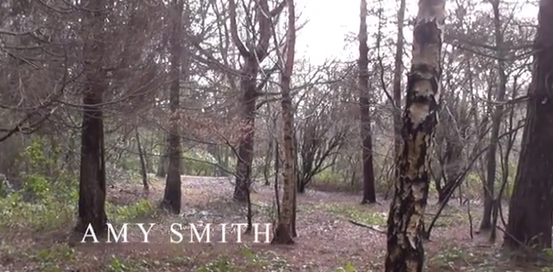
This screen grab denotes how the the titles we chose fade in and out on screen. We chose to have the titles white as the colour can be easily associated with ghosts, connoting that death is a theme in our film. Also, a white font looked best with our footage as it stood out but wasn't too overpowering. The soft fade in and out of the titles doesn't take the attention away from the film itself.
On the left is a full screen shot of our titles from our final project. This image shows how they are placed on the screen and highlights the composition of the text.
This part of the editing process was key as it gave my group to make sure our project was completed well and pick up on any minor errors and aspects of our project that might have needed correcting. Adding the titles was also important as we had to make sure our titles linked to the conventions in our genre.
No comments:
Post a Comment