Evaluation 7 from bethbrewer12
Friday, 4 April 2014
Evaluation - Question Seven
My group member Beth has chose to answeer this question using a powerpoint that is embedded below using SlideShare. In the powerpoint she has written about the similarities and differenences between the preliminary task and final project.
Evaluation - Question Six
What have you learnt about technologies from the process of constructing this product?
I've answered this question by creating a timeline for my group on the website TimeToast. Using a timeline allows my group to answer this question in an interactive, systematic, organised and engaging format.The timeline answering this question is embedded below.
Thursday, 3 April 2014
Evaluation - Question Four
Who would be the audience for your media product?
I've chosen to answer this question in the form of a GoAnimate animation, the videos are embedded below. I've created a profile of a typical audience member viewing my groups final film project on GoAnimate.
Within the animations the profile entails information on the target audience members hobbies and interests as well as a little bit of pshycographic information.
who would be the target audience of your product? by s_tak on GoAnimateWithin the animations the profile entails information on the target audience members hobbies and interests as well as a little bit of pshycographic information.
who would be the target audience of your product 2 by s_tak on GoAnimate
Our film would appeal to Emma because she has an interest in murder mystery/crime tv shows which can be similar to psychological thrillers and horror films . Also Emma is a teenage girl with a clear liking for horror films and so she would probably look forward to watching my groups film 'The Perpetrator' in cinemas, because the leading actress in our film is a teenage girl from London. Taking note of this Emma may be appealed to watch our film because she finds the leading actress similar to her, related to the uses and gratifications model; she would find our media text appealing because it personally appeals to her and presents her with a role model/ someone she can look up to. Furthermore, 'The Perpetrator' is similar and in the same genre of some of her favorite films. So our film would easily appeal to her. It can be noted that my groups target audience questionnaire results have also made it clear that a girl in Emma's age range like our ideal target audience.
Evaluation - Question Five
How did you attract/address your audience?
My group member Amy has answered this question. Amy has answered part of the question by creating an online presentation on the website Kizoa.Kizoa slideshow: evaluation - Slideshow
Below the annotation tool on YouTube is used to highlight how my group has specifically tried to address and attract our audience to our opening titles and sequence. I've embedded the video below.
Evaluations - Question Three
What kind of media institution might distribute your media product and why?
My group member Amy has answered this question by creating an online mindmap on the website Bubbl, which I have embedded on to my blog below.
Wednesday, 2 April 2014
Evaluation - Question Two
How does your media product represent particular social groups?

Our sequence 'The Perpetrator' mainly depicts young teenage girls, we have chosen to use this particular social group because young teenage girls are stereotypically quite naive and oblivious to dangerous situations. This is ideal for horror films as there is already some kind of danger, which created a greater thrill for the audience.
To the left is a collage I have created using Photoshop, I have chosen to compare our main character with 'Jill' from Scream 4. 'Jill' is a prime example of how characters are denoted, so I have created a character for our horror film, that was widely influenced from 'Jill' from Scream 4.
Both characters are attired similarly, they both wear subtle clothing, that does not attract attention, this connotes that they are simplistic and oblivious to any danger that may befall them. Both 'Jill' and our character take the role of the victim in their horror films, which could be as a result of their oblivion to danger and their simplistic view of life.
However 'Jill' is filming this scene in the night, which is slightly more conventional for a horror film, however when we were filming, we discovered that night time filming was impractical as it was not entirely clear what was happening. Therefore we have done our filming in daylight, where it is clear and coherent what is happening.
All in all the elements listed above help to represent a normal social group, my groups final film project also aims to represent this social collective. The teenage actor in our final project looks like a normal everyday teenager - wearing casual clothing and acting like most teenagers do, doing nothing out of the ordinary or anything out of character for a teenager in today's day and age.
Tuesday, 1 April 2014
Evaluation - Question One
In what ways does your media product use develop or challenge forms and conventions of real media products?

- The first frame denotes the location/setting in our film. It is a slow panning shot, acting as an establishing shot. From this shot it becomes clear to viewers that the film is set in an abandoned forest, a conventional setting of the horror film. Shots like this are typical in film openings as they grab viewers attention and help to create a mood for the overall film. In this case the slow paced shot creates an eerie mood
- The main character Amy, in this scene, is introduced in our second shot. Like most conventional film openings the main character(s) in the film are introduced in the opening sequence. We have used a low angle shot to introduce Amy, as she walks towards and past the camera, into the forest.
- The title font is shown in the third frame. and it looks quite bold and eye catching. My group chose to use a simplistic font because in horror titles the fonts aren't usually over styled. We gave our white titles font a glow and shadow making it seem ghostlyconnoting that our films narrative explores people dying. In horror films it's conventional for title fonts to reflect the story line of the whole film. For example in 'The Cabin In The Woods' the titles font looks like dripping blood, connoting that the film has a dangerous/violent story line.

- The fourth image in the contact sheet highlights how our opening sequence suggests the genre of our film. This is another conventional feature of film openings. We have made it clear that our genre is horror by using an isolated forest, creating a tense mood. Also Amy,our main character, is young and blind to the dangers around her another stereotypical feature in horror films. Furthermore, this camera angle suggests that someone is watching Amy from afar, connoting that she could be in great danger in the next few scenes of the film.
- Costume and props are denoted in this image. Amy, is denoted in the frame wearing leggings, a hooded body warmer, a black jumper and a plain white t shirt. Her whole outfit follows the stereotypical representation of teenagers, as she is wearing informal clothing. Also her hoodie is a piece of iconography associated with teenagers.
- Camera work and editing is denoted in the next frame. My group have used a match on action editing technique in this part of the film. It's quite conventional for this techniques to be used in all genre films.
- My group has used special effects in this frame. We put a tinted filter onto this frame, to make it seem like Amy is being looked at from another characters perspective. This is also connoted by the framing of this shot as Amy is being observed through tree branches, connoting that someone is secretly watching her. We also used a hand held filming effect in this part of the film to make it look like a point of view shot.
- The story builds up as the opening sequence progresses. Amy is last seen on screen looking shocked and frightened, leaving viewers wondering what will happen next. This sets the story of the film up and suggests that someone of great danger is in Amy's town. To keep our titles conventional we decided to keep them slow paced and not have too much action in them, as this would go against typical film titles. Similar to films like 'Scream' Amy's story is building up to the main story in the film and we have tried to draw inspiration from Saw where one of the various characters in the film is killed off in the opening.
- The last image on our contact sheet is of the main title in our opening. We decided to have the main title at the end of our opening sequence as it has a dramatic entrance and leaves a cliff hanger as to how the story will further unfold in the film. It's also conventional for the title to be after the opening sequence in the film in some horror films, as seen in the video below from Scream 4. My group chose the title 'The Perpetrator' because it means "someone who commits a crime or evil". The title reflects the horror genre. It also relates to the story line in our film where a serial killer is on the lose.
The video above is related to the points made about stills 8 and 9
Overall, my groups opening sequence and titles are meant to be conventional of the horror genre.
Thursday, 27 March 2014
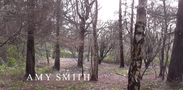
Final Titles and Opening Scene
My groups final titles is embedded above. My group member Amy had an acting role in the final project, Beth was incharge of filming and camerawork and I had a directing/producing role. All three of us worked on editing the project on Final Cut.
Thursday, 20 March 2014
Editing - Stage Three
At the last stage of editing, we added titles and made small make sure our project was of the best quality. For our credits we chose to use a simple yet bold font that was conventional to the horror genre. There are some screen shots below of adding titles to our project.


This screen grab denotes how the the titles we chose fade in and out on screen. We chose to have the titles white as the colour can be easily associated with ghosts, connoting that death is a theme in our film. Also, a white font looked best with our footage as it stood out but wasn't too overpowering. The soft fade in and out of the titles doesn't take the attention away from the film itself.
On the left is a full screen shot of our titles from our final project. This image shows how they are placed on the screen and highlights the composition of the text.
This part of the editing process was key as it gave my group to make sure our project was completed well and pick up on any minor errors and aspects of our project that might have needed correcting. Adding the titles was also important as we had to make sure our titles linked to the conventions in our genre.
We decided that the titles that best fit our project was 'Feature' in Final Cut. What we liked about this title was that it subtly faded in and out connoting a mysterious atmosphere for viewers. We chose to keep the titles capitalised as this is conventional of opening titles.
In this image we were experimenting with the placement of the titles on top of the clip.This screen grab denotes how the the titles we chose fade in and out on screen. We chose to have the titles white as the colour can be easily associated with ghosts, connoting that death is a theme in our film. Also, a white font looked best with our footage as it stood out but wasn't too overpowering. The soft fade in and out of the titles doesn't take the attention away from the film itself.
On the left is a full screen shot of our titles from our final project. This image shows how they are placed on the screen and highlights the composition of the text.
This part of the editing process was key as it gave my group to make sure our project was completed well and pick up on any minor errors and aspects of our project that might have needed correcting. Adding the titles was also important as we had to make sure our titles linked to the conventions in our genre.
Wednesday, 19 March 2014
Editing - Stage Two
Having edited most of our footage we decided to include copy right free sound effects and soundtracks to our film project. We wanted to add sound to our project to create a scary/suspenseful mood, using sound in this way is a key convention in horror opening sequences and films. The sound effects used are from the website SoundCrate, which is shown in a screenshot below.

Here is a screen grab of the music we added to our film project.We had to trim the clip in some sections and split it to make it match the actions in the film and to build suspense at the right time.

This editing process was key in our project because it allowed my group to realise which music and sound effects were best suited to our film, and genre. The sound will have a large impact on our final video as it will help create an appealing and entertaining film that draws viewers in and creates a mood.
Here is a screen grab of the music we added to our film project.We had to trim the clip in some sections and split it to make it match the actions in the film and to build suspense at the right time.
This editing process was key in our project because it allowed my group to realise which music and sound effects were best suited to our film, and genre. The sound will have a large impact on our final video as it will help create an appealing and entertaining film that draws viewers in and creates a mood.
Tuesday, 18 March 2014
Editing - Stage One
In today's lesson we started editing our film footage as a group, so far we have put a few shots into Final Cut and we have started cutting off excess parts of the clips that are unneeded or excess. Below are the screen shots of some of the editing stages in Final Cut.
1. First we uploaded footage into Final Cut, ensuring it is in chronological order and follows our storyboard

2. Then we chose where parts of the clips need to be cut off and are unneeded. We used the cut/split clip tool to do so
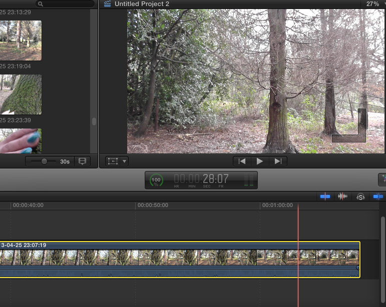
3. Having chose the unneeded clips we cut them out of our film reel

This proccess is a key stage in creating our final titles sequence, editing the clips in order and altering sound etc is very important. Also, this process allowed us to apply our editing knowledge like match on action and shot reverse shot as well as other skills.
Monday, 17 March 2014
Behind The Scenes Filming Shots
Below I've embedded some pictures of my group filming our final project in Bentley Priory park,using a PhotoSnack slideshow. My group member Beth has the role of filming, Amy is the main actress in our project and I'm the director in the images.
Thursday, 13 March 2014
Pre-filming activity
Canted angle test footage
As a group we decided to try out one of our filming shots prior to going out and filming because we thought it would be useful to run through shots to make the filming process easier. We decided to trial a canted angle from floor level because we thought it would be a good shot to use in our final project to help introduced our main character on screen, a convention of opening titles and scenes. Also, in a woods filming setting it could be difficult to film this on a forest floor. So, we did a run through to make sure we can easily film this shot type in our film setting.
Editing
In Final cut we tried applying filters onto the footage to make the lighting darker. We wanted to alter lighting as it's conventional for horror films to have dark/gloomy lighting to create an eerie and thrilling atmosphere for viewers.
One of the filters experimented with was called 'Isolate' in Final Cut. What was good about this filter was it made the footage slightly darker lit (I've uploaded a screen shot of the footage before and after applying the filter below). The change in lighting was conventional of the horror genre and overall creates a good effect. This could be a good filter to apply to our final film project to create a scary mood for audiences.


This effect could be good to use if it's raining on the day we film as it will make the footage seem suited to the filming surroundings and help make the shot look realistic to our film environment. The filter also focuses on Beth's shoes when she's walk making the shot successful as she's the main focus.
We also tried out using some audio filters to make the sound of her walking more prominent in the clip. After listening to the sound filters 'Cathedral' and 'Delay Designer' we chose to use the latter audio effect to enhance the natural sounds of birds and Beth's footsteps, as it will draw focus on her entrance in the footage. This audio filter good be good to use in our final project.

Edited test footage
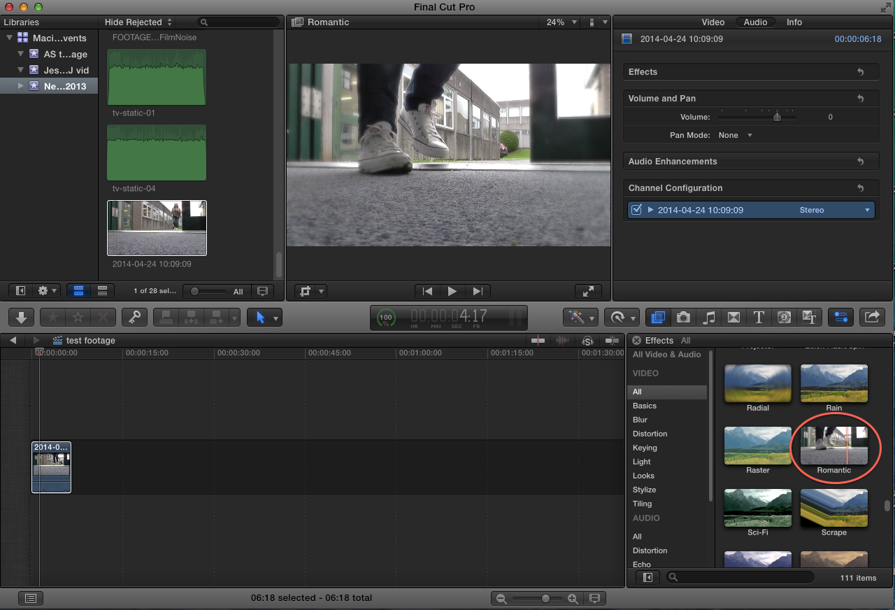
Editing
In Final cut we tried applying filters onto the footage to make the lighting darker. We wanted to alter lighting as it's conventional for horror films to have dark/gloomy lighting to create an eerie and thrilling atmosphere for viewers.
One of the filters experimented with was called 'Isolate' in Final Cut. What was good about this filter was it made the footage slightly darker lit (I've uploaded a screen shot of the footage before and after applying the filter below). The change in lighting was conventional of the horror genre and overall creates a good effect. This could be a good filter to apply to our final film project to create a scary mood for audiences.
Another filter that we liked in Final Cut was called 'Romantic', it added a slightly hazy effect to the shot.
This effect could be good to use if it's raining on the day we film as it will make the footage seem suited to the filming surroundings and help make the shot look realistic to our film environment. The filter also focuses on Beth's shoes when she's walk making the shot successful as she's the main focus.
We also tried out using some audio filters to make the sound of her walking more prominent in the clip. After listening to the sound filters 'Cathedral' and 'Delay Designer' we chose to use the latter audio effect to enhance the natural sounds of birds and Beth's footsteps, as it will draw focus on her entrance in the footage. This audio filter good be good to use in our final project.
Edited test footage
Friday, 7 March 2014
Health and Safety Form
Below I've attached a health and safety form, related to the risks and hazards whilst filming our final project. I have created this health and safety form and I've embedded it onto my blog by using SlideShare. Going through this form is very important for my group before we film as it will make us aware of the risks and dangers we should be cautious of and avoid whilst filming. Reading through this form will also decrease the chances of accidents as my group members and I will be more aware of our actions and surroundings.
Wednesday, 5 March 2014
Opening titles and scene storyboard
Here are images of the storyboard I have illustrated for our opening titles and scene, attached in the form of a flipbook created on the website Flipsnack, as a group we discussed and planned what each scene in the opening sequence would have in it. Creating a storyboard prior to filming is a good way for my group to get down our ideas and envision how our ideas will look on screen systematically. Story boarding is a key step in creating our final project as it lets us plan how we will film our project and allows us to be aware of the camera shots, sounds and length of our shots. Also, the story board for our final project acts as a guideline for my group to follow when filming the final project making the overall filming process more organised, preventing us from wasting time.
Shot List
Below is a shortlist my group member Amy has created for our opening sequence.
Shotlist template. from isthatamythough
A shot list is important to create prior to filming as it helps my group plan which camera angles and shots we want to use in our final project. It gave my group a chance to carefully consider the variety of shots we wanted to use in our titles and opening scene.
A shot list is important to create prior to filming as it helps my group plan which camera angles and shots we want to use in our final project. It gave my group a chance to carefully consider the variety of shots we wanted to use in our titles and opening scene.
Thursday, 27 February 2014
Costume

This outfit is meant to make the main character Amy look like a conventional teenager. For example she is wearing leggings, which is a very popular piece of clothing for all teenage girls. Also she's wearing a hooded body warmer, this item of clothing is similar to a hoodie. It can be noted that hoodies are stereotypically associated with teenagers and so, like a hoodie, the body warmer is a piece of iconography related to teenagers.
The all black outfit also helps create an eerie/tense mood for audiences. Our overall opening is going to have a dark colour scheme to connote danger, mystery and a scary story line. The chosen colour scheme also connotes that dark/bad things are going to occur in the next few scenes of the film.
Monday, 24 February 2014
Bentley Priory Filming Location Shots
Above I've embedded a flip book created on FlipSnack in the style of a photo album. The pictures in the flip book are filming locations my group would like to work from at Bentley Priory.
Most of the pictures I've embedded denote an empty forest. My group has chosen to use the forest to film our opening titles scene as it's a conventional location in horror films. We'd ideally like to film in an isolated section of the forest/woodlands at Bentley Priory as it would help create a tense,eerie mood in our final project. Also, forests are common in horror films;for example, The Cabin in the Woods had sections of the film shot in a deserted cabin in the woods.
Monday, 10 February 2014
Ident's created for the final project
Here are the initial storyboards created for the two idents my group wanted in our final titles. We decided to draw out storyboards of our idents first, because they gave us a chance to consider how our ideas would appear onscreen as one sequence. Creating story boards for our idents was important because it helped my group plan how we would make our idents. Also the storyboards gave us the opportunity to realise if our idea's could realistically be created like professional looking idents.


Final Idents
Below I've embedded from my YouTube two idents I've created for my groups final project using Final Cut Pro. My group decided that it would be more conventional to have two idents in our film opening, because when researching openings we found that it was very common for films to have two production company's.
We also decided that it would be conventional to have one ident representing a larger generic film production company and have another ident specifically for a film company that only produces horror films.
Ident 1
This ident it meant to represent a large film production company. We've chosen to use a cloudscape in this ident as it's quite conventional in large production companies idents and logos. For example Lionsgate, DreamWorks, Paramount, TriStar and Columbia all have cloudscapes and skies within their idents. Using cloudscapes connote that our production company is well rounded, and creates a variety of films. Furthermore, a cloudscape implies that the production company creates imaginative films and it's quite prestigious.


All though this ident is meant to represent a large film company we've also tried to make this ident alternative, to link to the horror genre film we are creating. To make the ident alternative we added a red tint onto the cloud scapes to connote that the film has bloodshed and danger within it's narrative. This ident was inspired by Lionsgate's alternative horror themed ident that they use in their horror films.
Ident 2
It's quite conventional for films to have two production companies so my group decided to create two opening idents for our final project. Our second ident represents a small production company that only creates horror films. To relate to the horror genre this ident has a black and red colour scheme which connotes that this company is creates thrilling and gruesome films. A red mist of blood sprays on screen in slow motion and then fades out into a black background in the ident. The title 'Eerie Entertainment' appears centered on screen and fades in and out of the ident alongside the red mist of blood that reverses off screen. A thrilling sound track was added to the ident to make it seem more scary and intriguing for viewers. The sound track was taken from the copyright free sound effects website Sound Crate.
This ident was inspired by similar horror production companies like 'Dimension Films' who produced the 'Scream' series.
Like Dimension films ident we've kept to a simple black background and text that flies into the center of the screen.
Tuesday, 4 February 2014
Idents Research
In today's lesson I learnt that an ident allows production companies to identify that they have helped create a film or TV show. Alternative idents can also help reinforce the genre of a film and also give viewers an insight into the story line of the film. Additionally, idents can somewhat start a film early and catch audiences attentions at the start of a movie; a 20 second ident can set a films mood and tone before a film has fully begun. Here is a link to a website I've used to research idents
Lionsgate
Below are two Lionsgate ident's used in the opening scenes of the films they produce. I've chosen to look at Lionsgate because the company is a leading horror film company. Considering that they are a large horror film company looking at their ident may help me gain ideas when creating my own horror ident for my final project.Design
The video above is Lionsgate's most recent film ident and it lasts 22 seconds long. At the start of the ident clogs and gears are denoted and they are the main focus of the shot. The camera pans around the gears denoting the gears all moving together and then the camera zooms out. The camera appears to move further away from the gears and continues to zoom out. The clogs are then shown moving through a key hole in a door, the camera continues to reverse zoom and then two majestic doors are thrown open. A flash of light shines through the doors and then the doors fully open denoting the word 'LIONSGATE' above clouds. The word 'LIONSGATE' is in the center of the screen denoted floating above clouds in emboldened capitalized sans serif font.
Intention
The gears and clogs in the ident could connote that Lionsgate ceates films which are complex. The metallic colours used in the gears and the door connote that Lionsgate is prestige company. The use of the gears within a key hole and then the doors opening could be a connotation of 'opening' up viewers imaginations. The clouds-cape could be a connotation of the heavens; heaven is unknown to people and so this suggests that Lionsgate like to imagine and discover the unknown in their films. More so, the light colours clouds could be a symbol of hope and beauty.
Lionsgate Alternative Ident
Design
The is an alternative Lionsgate ident I've found online that is commonly used in Lionsgates horror films. The ident starts off the same as the original Lionsgate ident denoting gears moving on screen with panning and the a reverse zoom with the camera moving backwards. However, the colour shceme in this ident differs from the original unlike the original dark red hue colours are used. The clogs are broze and rusty looking instead of looking metallic and clean like the original.The background colours are also much darker in this ident with orange, brown and red hues. The doors in this opening are also very dark and they don't have the prestigious lavish look which is denoted in the original ident. Unlike the original ident the clouds-cape is coloured red and dark brown and the text in the center of the screen is a dark grey. At the end of this ident the clouds-cape's dark red colours glow to a bright red with the text remaining in the center of the screen.
Intention
The dominant red colour scheme connotes danger, violence and is very eyecatching. More so, the red colour scheme suggests that Lionsgate is creating a film with bloodshed, and so the colours used in this ident reflect the genre of the film. The camera denoting rusty,dark coloured gears also connotes that Lionsgate is creating a dark and mysterious film. Furthermore, the gates opening to a red clouded sky connotes idea's of hell and darkness, which again implies that a film using this ident has an eerie dark story line.
DreamWorks
The second set of idents I've chosen to look at are by DreamWorks entertainment, I've chosen to look at this company as I feel that they are well known for creating alternative idents to relate to story lines and themes explored for each film they create. I could draw inspiration from this and create a unique alternative ident which clearly denotes the themes that my final project will include. I'm looking at two of DreamWorks idents because DreamWorks is a company that creates various alternative indents for each of their films in relation to their story lines. For example the Shrek movies have their own alternative idents under DreamWorks. I think an ident should relate to a films narrative and therefore it could be interesting to look at some of DreamWorks idents, as they can inspire and influence how I create my own ident for my final project.Design
This ident is DreamWorks Home Entertainment most popular opening ident and it lasts 28 seconds long. The ident denotes a young boy sitting on the moon fishing from the sky. DreamWorks ident starts off with the camera tracking upwards from a reflection of the boys fishing rod in the water to clouds in the sky and then a boy sitting on the moon. The letters in 'DreamWorks' pan onscreen from right to left and then the title 'DreamWorks' appears centered on screen with a reverse zoom. 'DreamWorks' is denoted floating in the clouds.
Intention
The notion of 'DreamWorks' up amongst the clouds could connote that DreamWorks is a company that makes imaginative films making the impossible seem possible. Also, the little boy on the moon could connote that DreamWorks creates films with children in mind, as their target audience, or that their movies aim to remind viewers of their childhood. The blue and white colour scheme relates to the sky and the clouds which again connotes imagination.
The Ring Altervative Ident
(click on the image to view the video)

The second ident I've chosen to look at is DreamWorks alternative ident for the horror film 'The Ring'. I've chose to look at this specific ident and DreamWorks doesn't usually make horror films and looking at a horror films ident will be relevant to my final project as I'm working under the horror genre.
Design
Like the previous ident, the camera tracks upwards towards the sky and focuses in onto the young boy sitting on the moon fishing. However, instead of the simplistic calm blue and white colour scheme a black sky, grey gloomy clouds and a metallic glowing blue/white moon. The colours are much darker and gloomy than the original. The ident denotes a glitch/white noise in parts of the clip and then the moon is shown with another crescent half, which creates a mysterious full glowing circle on screen. Also, the sound of dripping water in a well is also used in this ident.
Intention
The water sound effect, creates a tense eerie mood and the noise also foreshadows a dark storyline; sound effects are important in an ident as it makes a film impactful and engaging to viewers from the very start. The white noise in the ident connotes a dark storyline and also implies that the narrative in 'The Ring' could relate to an old movie or cassette. Also the white noise randomly appears onto screen and this could make viewers jump or grab their attention from the start of the film. The overall dark colourscheme connotes that 'The Ring' is a horror film with a dark narrative. From looking at this ident it's clear that editing and sound help reinforce a films genre and so, when creating my ident I should try and make the horror genre clear.
Researching film idents in todays lesson has been a good activity as it's made it clear to my group what the idents in our opening sequence should look like. Also the information found in this research can influence the design of my groups idents. It's important to look at examples of conventional idents like the ones above as it shows my group what we should aim to recreate in our project.
Thursday, 16 January 2014
Horror Film Step Outline(s)
To gain further ideas and inspiration for creating the opening credits and scene of a horror film my group has decided to analyse two horror film openings.
The Cabin in the Woods
The first outline is on the film The Cabin in the Woods which my group member Beth and I worked on analyzing together.
Sweeny Todd
My group member Amy also chose to analyse the first two minutes of the horror film Sweeny Todd.
This activity was useful as it showed my group what is conventional of the opening titles and scene in the horror genre. So, carrying out this research helped inspire my group with ideas for our final project and showed us what a conventional 2 minute opening of a horror film is, helping us realise what we need to include in our project.
Monday, 6 January 2014
Film Pitch and Padlet Feedback
Above I've uploaded a SlideShare document entailing my groups first film pitch for our opening title sequence. The film pitch includes a synopsis of our horror films story line, indicates the resources and locations needed in our film and also includes information on the title of our film and its sub genre.
Below I've embedded a padlet document which includes feedback from my peers in relation to my treatment. This feedback is very important and can be very influential on how we create our horror film as a whole, as my group needs to meet our target audiences needs.
Created with Padlet
From looking at the padlet a few things need to be kept in mind and changed in our final treatment:
- We need to avoid trying to fit too much of the narrative into the opening of the film, as it wouldn't be conventional and in reality the start of films don't have too much happening in them straight away
- In our draft treatment we made a mistake with our films name and this error was pointed out by our peers, we mistakingly named it 'The Protagonist' but it's meant to be called 'The Perpetrator' so we need to make sure we change the name
- Also one of my peers suggested that we make sure that the actor playing the 'Perpetrator' acts realistically, this could be difficult to film and so we decided to have the 'Perpetrators' perspective filmed from shaky point of view shots
This stage of audience feedback is very important as it makes it clear what the target audience of our film expect and what they would like to see in our opening. Also the feedback highlighted any overlooked errors in our draft and made it clear to us what was realistic to film and what the audience would find believable in our film.
Subscribe to:
Posts (Atom)